By the time an account tells you it is churning, the decision was made months ago. The renewal call is a formality on a choice that formed quietly across a dozen small signals nobody was tracking. An account health system exists to catch that drift while it is still reversible – to turn churn from a surprise into a forecast. Here is how the system is built, component by component.
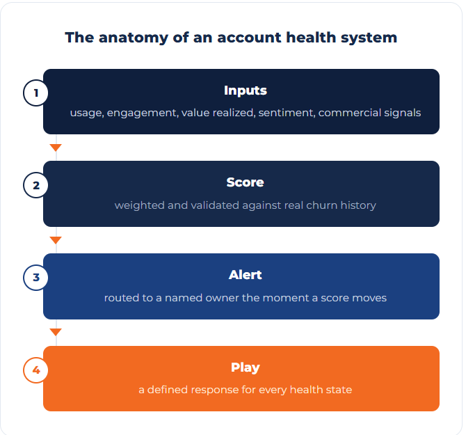
This is not a single dashboard number. A real health system has an anatomy: inputs, a scoring layer, an alerting layer, and a set of plays that fire when a score moves. Skip any layer and you have decoration, not a system. The diagram below is the whole machine – each layer feeding the next, ending in action rather than awareness.
The anatomy of an account health system
Inputs
usage, engagement, value realized, sentiment, commercial signals
Score
weighted and validated against real churn history
Alert
routed to a named owner the moment a score moves
Play
a defined response for every health state
Four layers, in order. Most teams build the first two and stop – which is why their health score is a report, not a system. The value is in the alert and the play.
The inputs: what actually predicts churn
According to ChurnZero’s 2025 Customer Revenue Leadership Study, 73% of customer success leaders admit their current health score fails to reliably predict churn – usually because it tracks activity instead of the signals that actually precede cancellation.
Health scores fail when they are built on what is easy to measure instead of what is predictive. Product usage is the obvious input, but for services and relationship-led SaaS the human signals matter just as much – sometimes more. Getting this wrong is exactly what drives churn that nobody saw coming. An account can be using the product daily and still be quietly deciding to leave, because the person who championed you left and nobody noticed.
Engagement depth
Frequency and quality of interaction – are meetings happening, are emails answered, is the champion still leaning in?
Product / delivery usage
For SaaS, adoption against the scope purchased. For services, utilization and satisfaction with delivered work.
Stakeholder coverage
How many real relationships you hold. A single-threaded account is fragile no matter how green the usage looks.
Value realization
Whether the client has actually achieved the outcome they bought. Unrealized value is the quietest churn driver of all.
Sentiment
Support tone, QBR mood, escalation patterns – the qualitative signals a spreadsheet usually ignores.
Commercial signals
Late payments, downgrade questions, and procurement re-reviews that surface before the renewal ever appears.
The scoring layer: turn signals into a number people trust
A health score is only useful if the team believes it. That means weighting the inputs deliberately – usage and value realization should outweigh vanity signals, and validating the model against accounts that actually churned. A score that was green the month before a client left is worse than no score, because it teaches the team to ignore the system.
Validation is not a one-time exercise. Markets shift, your product changes, and the signals that predicted churn last year lose their edge. Re-run the correlation quarterly against the accounts that actually left, and be willing to demote an input that has stopped predicting. A health model that is never recalibrated slowly drifts back into measuring what is easy instead of what matters, and the team’s trust drifts with it.
KEY METRIC TO TRACK
Score-to-outcome correlation – how often a red score preceded actual churn. Recalibrate the weights until the score genuinely predicts, rather than merely reports.
The dashboard: see the whole book at a glance
Once the score is trusted, distribute the book across it. The point of the view below is not the individual scores – it is the shape of the portfolio. A cluster in amber that nobody is working is a slow-motion revenue leak; a healthy green cohort is your expansion pipeline hiding in plain sight.
Account health distribution across the book
Green accounts → expand
Amber accounts → diagnose
Red accounts → save motion
The distribution tells you where to spend the week: greens to expand, ambers to diagnose before they slip, reds into a save motion now. A score with no action attached is a smoke detector with the battery removed.
Two benchmarks anchor the whole system, and they are worth stating in absolute terms because teams drift without them. Logo retention should sit inside an 85–90% band – land at the floor and you are one bad quarter from trouble. Net revenue retention should clear 100%: below that line, expansion isn’t covering churn and contraction, and the book is shrinking even if the logo count holds. When a real portfolio shows logo retention near the floor and NRR under 100% while average contract value rises, you have the sharpest question in account management – deliberate ICP migration, or masked churn?
THE TWO BENCHMARKS THAT ANCHOR ACCOUNT HEALTH
85-90%
Logo retention
band
land above the floor
>100%
NRR healthy
line
expansion beats churn
↑ ACV
Rising contract value
migration or churn?
Logo retention inside 85–90% and NRR above 100% are the guardrails. Rising ACV alongside falling logos is the tension a health system is built to surface – not smooth over.
The alerting layer: make the score impossible to ignore
A health score buried in a monthly report changes nothing. The value is in the movement – a score dropping two bands should surface to the account owner within days, not at the next review. Alert on change, not just on absolute level, because a healthy account trending down fast is often a bigger risk than an account that has been amber and stable for a year.
- Alert on rapid drops, not only on low absolute scores.
- Route the alert to a named owner with a clock attached, so it becomes an action rather than a notification.
- Escalate accounts that stay red past a threshold – silence is not resolution.
Ownership is the piece that makes alerting real. An alert that lands in a shared channel belongs to no one and gets scrolled past; an alert routed to a named account owner with a due date becomes a task. The system should make it trivially clear who is responsible for a slipping account and by when they must respond, because the entire value of early warning evaporates if the warning has no one obligated to act on it.
The play layer: what happens when a score moves
The final component is the one most teams skip: a defined response for each health state. A red score with no attached play is just anxiety. Map a play to each band so the system produces action instead of awareness.
| HEALTH STATE | WHAT IT MEANS | THE PLAY |
|---|---|---|
| Green | Value realized, multi-threaded | Pursue expansion – this is your growth pipeline |
| Amber | Drifting on one or more inputs | Diagnose the specific input; schedule a value review |
| Red | Multiple weak signals or a fast drop | Executive engagement, recovery plan, retention offer |
| Critical | Renewal at risk in-cycle | Full save motion – senior sponsor, root-cause fix, terms |
A health score you don't act on is a smoke detector with the battery removed.
Wrap up
An account health system is four layers working together: predictive inputs, a trusted score, alerting on movement, and a play for every state. Build all four and churn becomes something you see forming and intervene on – not something you discover on the renewal call. Start with the inputs that actually predict loss in your business, validate the score against your real churn history, and never ship a score band without the play that answers it.